
How to create a seamless Instagram carousel
A seamless Instagram carousel is a multi-slide post where your content flows unbroken across slides as users swipe. Here's how to create one on your phone in four steps: pick a format (most use 4:5 portrait), prepare your content (one wide image or a mix of several pictures), lay it out and align it on Exposure's large canvas, then export each slide as an individual image, ready to post.
The 4-step process
- 1
Pick the right format
Use 4:5 portrait (1080×1350 px per slide) for maximum feed real estate. This is the format Instagram displays largest. Avoid 1:1 square, because your carousel will get cropped on mobile previews.
- 2
Prepare your content
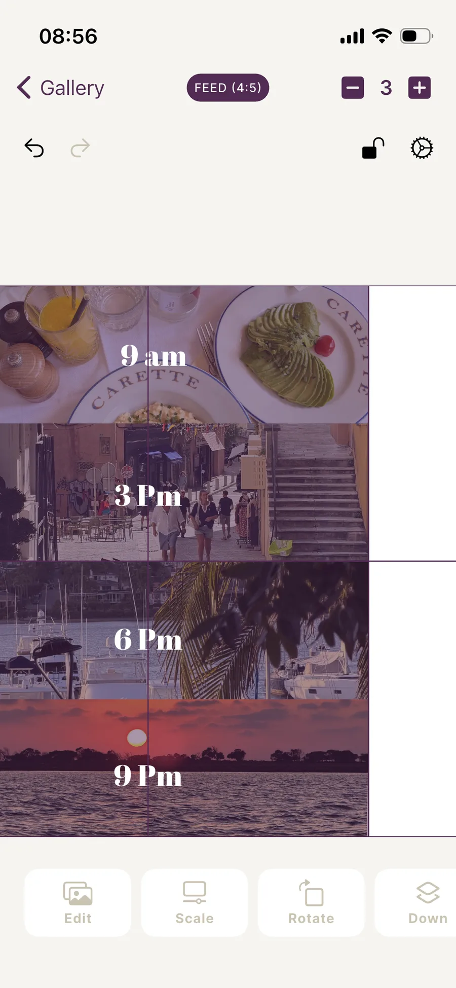
No matter what format your photos were shot in, you don't need to worry about it to build a carousel. Exposure isn't restricted to one specific size or aspect ratio. Its large canvas lets you combine multiple pictures, use shorter images and crop or transform them freely, or go with one wide photo if you prefer. You don't need to calculate exact dimensions by hand like the old wide-image workflow required. Adding a slide in Exposure takes one tap, and you don't have to add up pixels by hand like in competing tools.
- 3
Lay out and align your content on the canvas
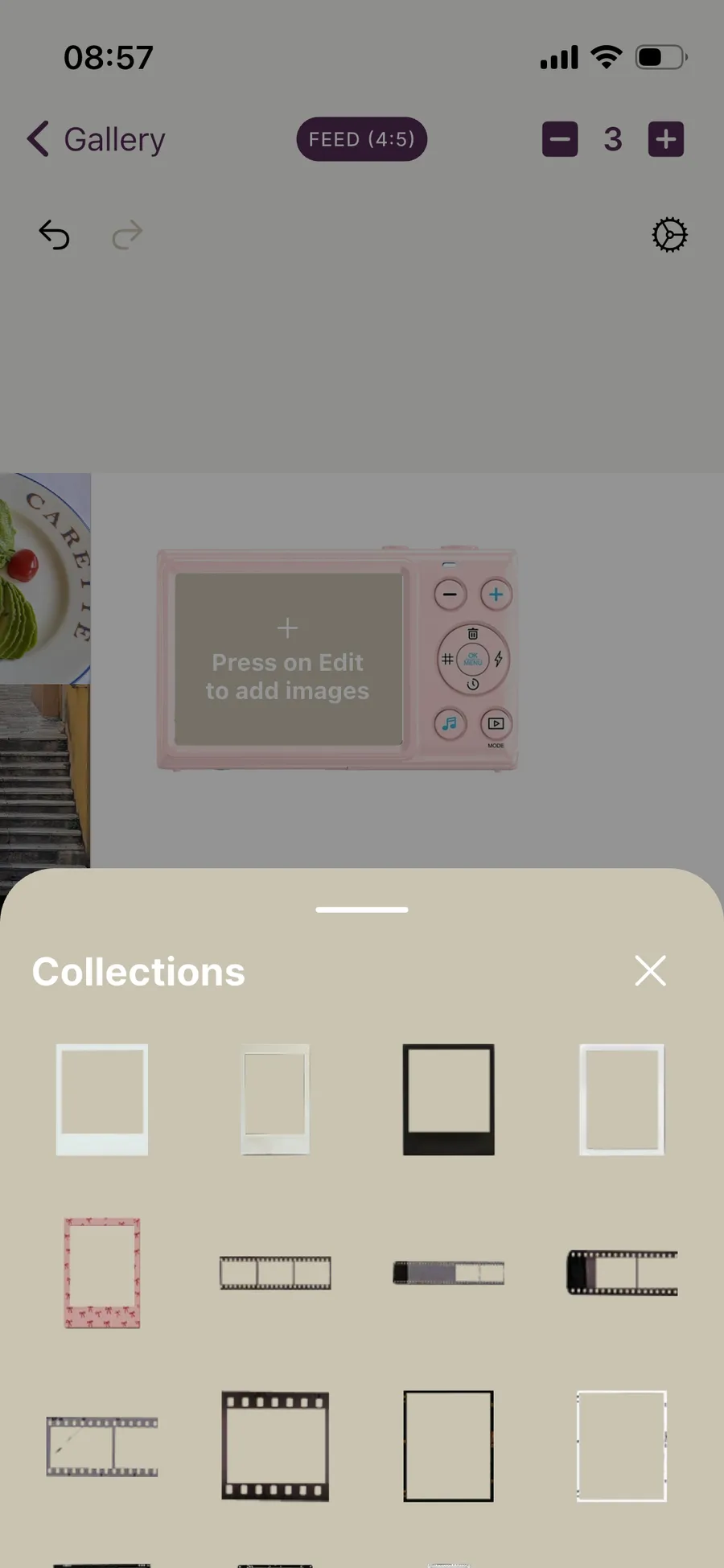
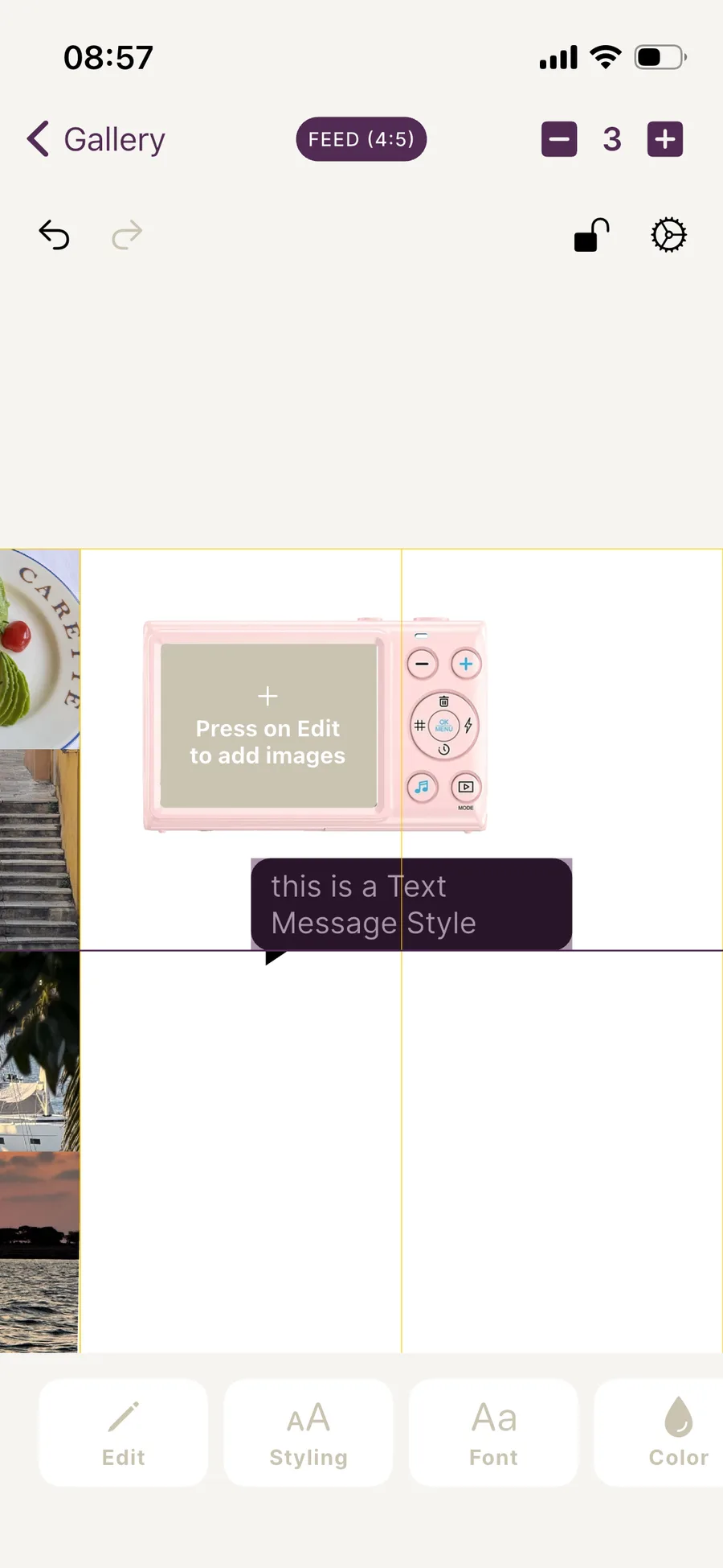
Arrange and align your content on Exposure's canvas. Use the app's built-in library of sticker frames, grids, text elements and more. Change fonts, switch shape styles, and combine images freely. Prefer not to design from scratch? Start from one of Exposure's pre-built carousel templates instead.
- 4
Post your carousel to Instagram
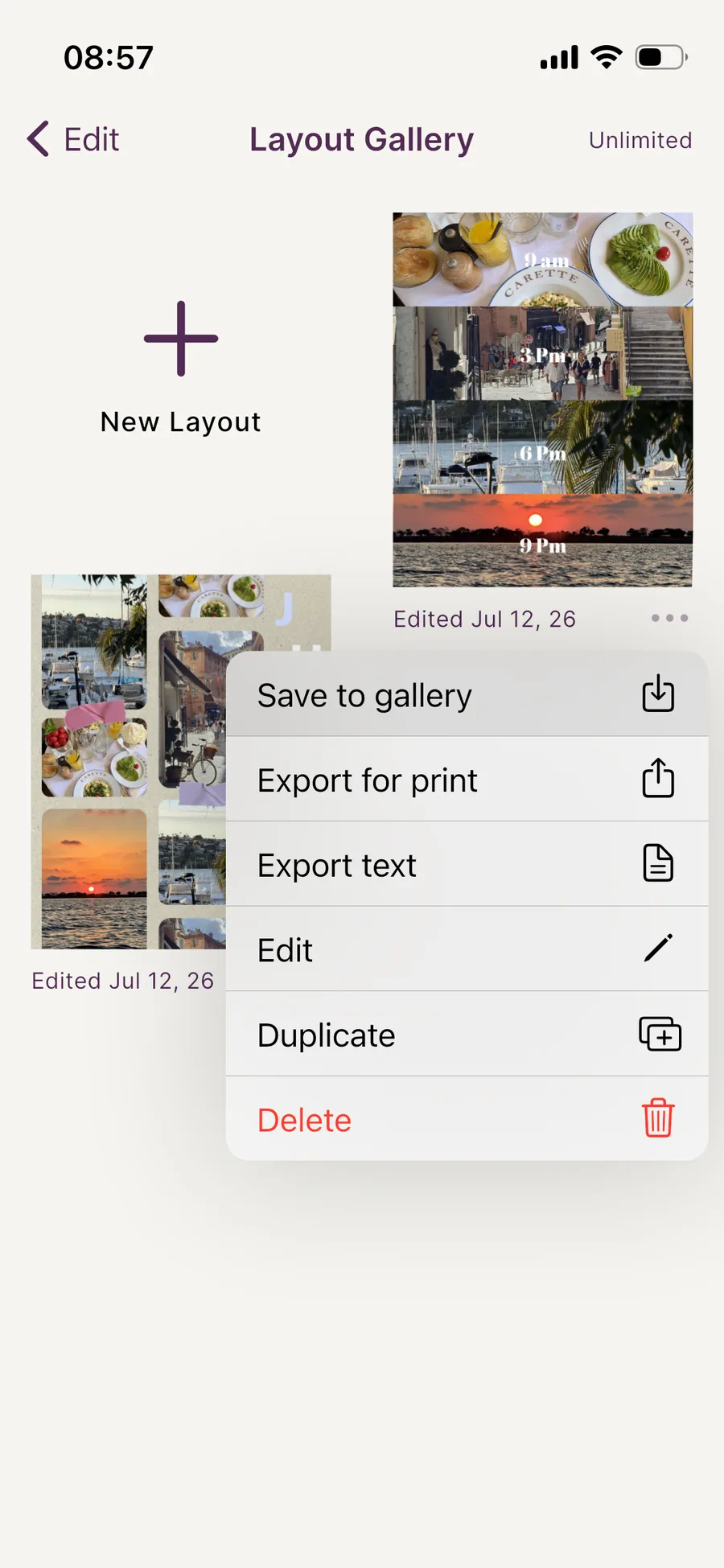
Each slide needs to be posted as a separate image. Exposure exports every slide individually for you, whether you used one wide image or built your layout from multiple pictures, so you don't need a separate slicing tool. In Instagram, create a new post, tap Select Multiple, and add slides in order. The app posts them as a carousel with the seamless effect intact.
Why creators use seamless carousels
When an image continues off-screen, people want to see where it goes. The first swipe is the hardest to get on Instagram, and a seamless carousel gets it because the image clearly continues. Multi-slide posts also tend to do better than single images on time-on-post and saves.
Common mistakes
Seamless carousels usually fail for one of two reasons:
- Misalignment. A 1-pixel shift between slides looks broken. Use a tool that handles slicing automatically rather than manual cropping.
- Wasted final slide. Most viewers never reach slide 10. Put your most important visual moment in slides 2–5, not at the end.
Worked example: sizing your source image by slide count
If you’re going the classic route with one wide source image (rather than arranging multiple pictures creatively on the canvas), the math is the same at any slide count: source width = slide width × number of slides, with the height held constant. At 4:5 portrait (1080×1350 px per slide), here’s what that looks like in practice:
- 3 slides: source image 3240×1350 px. Good for a single wide subject such as a skyline, a group shot or a short before/after.
- 5 slides: source image 5400×1350 px. The sweet spot for most posts, with enough room for a panorama or a short sequence without losing viewers before the end.
- 10 slides: source image 10800×1350 px. At this width, small misalignments become much more visible relative to the frame, so precise, automatic slicing matters more than at 3–5 slides.
- 20 slides (Instagram’s maximum): source image 21600×1350 px. Only worth it for long panoramas or story sequences.
If your source photo doesn’t naturally match this ratio, crop or extend the canvas to the target width first. If you stretch a narrower image to fit, it gets slightly distorted, and the carousel looks “off” even if viewers can’t say why.
Free vs. Suite: how many slides you can actually export
Exposure’s free tier includes 4 slides per layout, which covers the 3-slide example above with room to spare. For the 5- and 10-slide layouts, you need Exposure Suite, which unlocks the full 20-page canvas along with the complete template and font library. If you’re only occasionally posting longer carousels, the free tier’s 3 trial tokens let you try Suite-only features, including the extended slide count, before deciding whether to subscribe.
Seamless carousels on Reels, feed and TikTok compared
The technique is the same across platforms, but the format isn’t:
- Instagram feed: 4:5 portrait is the standard choice. It’s the largest a static post can display in-feed, which makes the seamless effect most visible.
- Instagram Reels cover / TikTok: 9:16 fills the entire vertical screen. Because the visible height is taller relative to width than 4:5, a carousel built for feed will look cropped if reused for a 9:16 placement without re-slicing at the taller ratio.
- TikTok photo carousels: support both 9:16 and 4:5. 9:16 reads as more “native” to the platform since it matches TikTok’s default video format, but 4:5 works fine for carousels ported over from Instagram.
Decide on your main platform before you slice. The same source image sliced at 4:5 and at 9:16 crops differently, and reslicing later changes where the seams fall.
When not to use seamless
Not every post needs the seamless treatment. Single strong images, repeating tile layouts and text-heavy quotes often work better as standard carousels or single posts. Seamless works best for images that continue naturally, like landscapes, panoramas, sequences and storytelling layouts.
Where to go next
- Still deciding what to post? See 15 Instagram carousel post ideas that actually get saves.
- Need the exact pixel sizes for Stories, Reels or TikTok too? See the full carousel size and dimensions guide.
- Want to add a personal touch with a cut-out sticker? See how to cut out a photo sticker for your collage.